
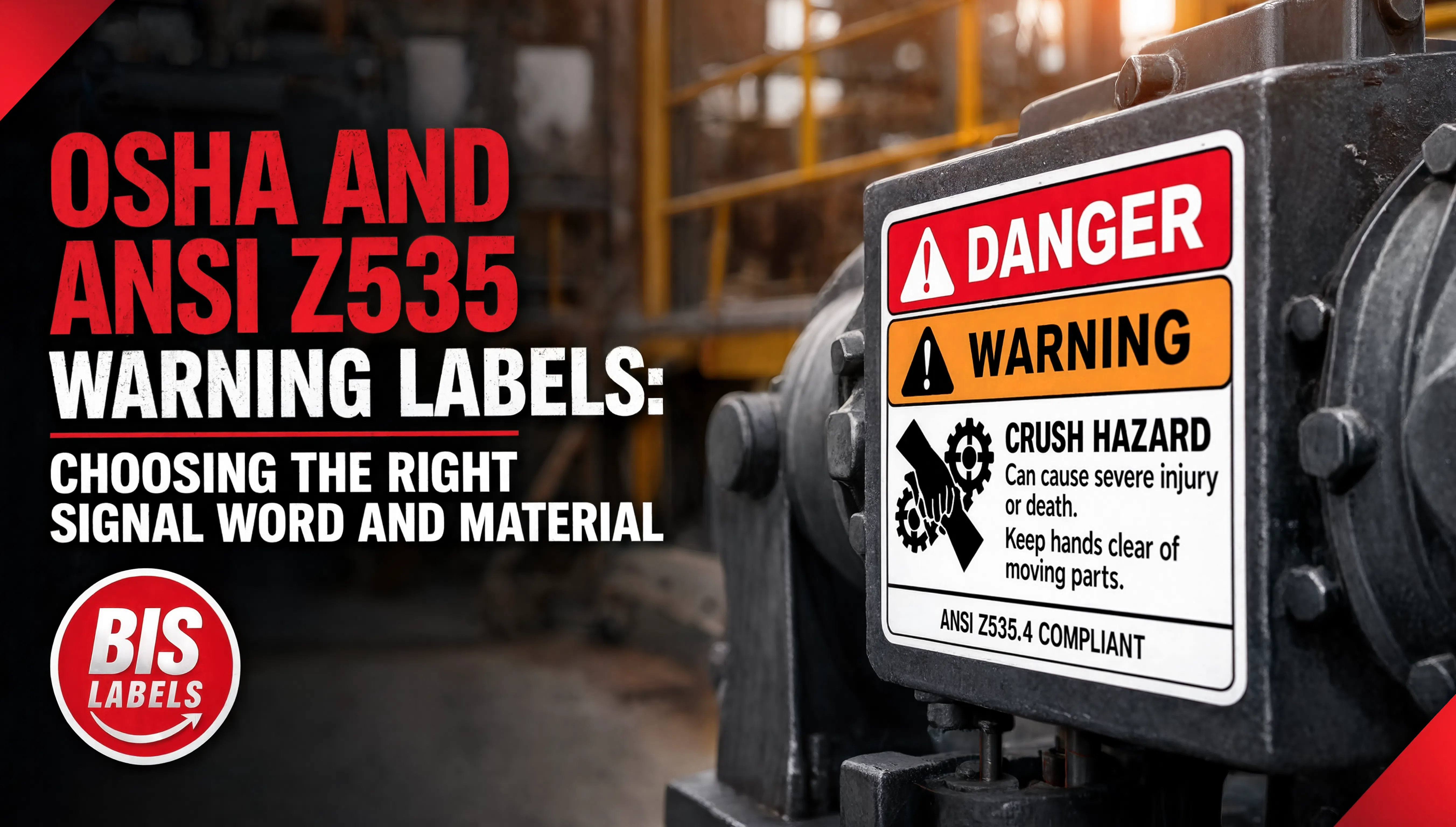
Most facilities have warning labels scattered across equipment, doorways, and hazard zones, and most of the time nobody has checked recently whether the word at the top of each one is actually the right one. Danger, Warning, Caution, and Notice are not interchangeable synonyms for "be careful." They are defined terms with specific meanings under OSHA and the ANSI Z535 standard, and using the wrong one, or mixing labels from different eras of the standard on the same site, undermines the entire point of having a hazard communication system that workers can read at a glance.
This is a facility safety labeling question, related to but distinct from the container labeling covered in GHS Compliant Chemical Labels and the piping identification covered in ANSI Pipe Marking Labels. Those standards govern what is inside a container or pipe. This one governs the general hazard warnings posted around equipment, work areas, and access points throughout a facility.
What Each Signal Word Actually Means
Under both OSHA's 29 CFR 1910.145 and the ANSI Z535 standard, the four signal words follow a hierarchy based on severity, not on how serious a facility feels a hazard is:
Danger indicates a hazardous situation that, if not avoided, will result in death or serious injury. Both standards limit Danger to the most extreme situations, such as unguarded high-voltage equipment or lockout points, rather than using it as a general attention-getter.
Warning indicates a hazardous situation that, if not avoided, could result in death or serious injury. This sits between Caution and Danger and is the header most commonly used for equipment hazards that are serious but not immediately life-threatening under normal conditions.
Caution indicates a hazardous situation that, if not avoided, may result in minor or moderate injury. It is also used without the safety alert symbol to flag unsafe practices that could cause property damage without a personal injury risk.
Notice addresses information that is important but not directly hazard-related, such as housekeeping rules, sanitation requirements, or general facility information. Notice does not use the safety alert triangle, since it is not describing a personal injury hazard.
The Color Code That Goes With Each Word
ANSI Z535.1 assigns specific colors to each signal word, and consistency across a facility matters as much as picking the right word to begin with:
- Danger: Red
- Warning: Orange
- Caution: Yellow
- Notice: Blue
- Safety instructions: Green
Mixing labels from different editions of the standard, or using a facility's own informal color scheme instead of the ANSI code, is one of the more common ways a labeling program quietly loses its effectiveness. A worker who has learned that red means immediate danger on one label should not encounter a different color doing the same job somewhere else in the same building.
Common Mistakes That Undermine a Warning Label Program
Overusing Danger. Because ANSI limits Danger to the most extreme situations, applying it broadly to every hazard in a facility dilutes its meaning and makes workers less likely to treat an actual Danger label with the urgency it deserves.
Skipping the pictogram. A signal word alone is less effective than a signal word paired with a pictogram, particularly in facilities with workers who speak different first languages. The pictogram carries meaning independent of the text.
Letting labels fade before the hazard does. A warning label that has faded to the point the color or text is hard to distinguish is functionally no better than no label at all, and in some cases worse, since it suggests a facility that is not maintaining its safety program.
Inconsistent placement. A label posted where it cannot be seen from the normal approach to a hazard, or one obscured by equipment, fails the same purpose test as a missing label.
Choosing Label Material That Holds Up
Because the color itself carries meaning under ANSI Z535, fading is a compliance problem, not just a cosmetic one. A floodcoated color construction, like Floodcoated Colors, builds the required color into the material rather than relying only on printed ink, which holds its color better against sun, heat, and repeated handling than a surface-printed label. For the legend text and any pictogram printed on top, a durable face stock such as Polyester White Gloss keeps the message legible through the same exposure that would fade a standard label.
For equipment and facility hazards specifically, purpose-built Warning Labels built to the ANSI Z535 color and signal word standard are the more reliable starting point than adapting a general-purpose label to the job.
A Practical Warning Label Audit Checklist
- Confirm every posted signal word matches the actual severity of the hazard it describes, not just the label a facility happened to have on hand
- Check color against the current ANSI Z535.1 code, and confirm the whole facility is using one consistent edition of the standard
- Verify labels are placed where they are visible from the normal approach to the hazard, not obscured by equipment or storage
- Replace any label that has faded to the point its signal word or color is difficult to distinguish
- Pair signal words with pictograms wherever the standard calls for one, rather than relying on text alone
Warning Labels That Still Read Correctly Years Later
BIS Labels supplies ANSI Z535 compliant warning labels, floodcoated color stock, and durable polyester face stock built to hold their signal word and color through years of facility exposure. Browse Warning Labels, Floodcoated Colors, and Polyester White Gloss, or request a quote and describe the hazards your facility needs to label, and our team will help you build a warning label program that reads correctly on day one and five years later.